Design that Connects, Communicates, and Elevates
Thoughtful design has the power to tell a story, build trust, and make a lasting impression. This portfolio showcases a range of branding, print, and digital design work created for small businesses, creatives, and campaigns.
From custom logos and branded templates to social media content and editorial layouts, each project reflects a collaborative process and a focus on clean, purposeful design. Whether developing a brand from the ground up or enhancing existing visuals, I aim to create work that is both visually striking and strategically aligned with each client's goals.
The following work samples were created through previous full-time roles and freelance projects using the Adobe Creative Suite. Hope you enjoy!
CIR Packaging & Product Support
During my time at Carolina Industrial Resources, I worked closely with clients to modernize and refine their product lines—from concept to shelf. While design was just one aspect of my role, I was responsible for helping bring customer visions to life through updated labels, packaging layouts, and product mockups. Much of this work involved clear, ongoing communication with clients, which strengthened my ability to translate ideas into effective visual solutions while managing expectations and timelines. These pieces reflect the collaborative process of balancing brand identity, packaging constraints, and customer feedback.
Butterfields
Early 2021
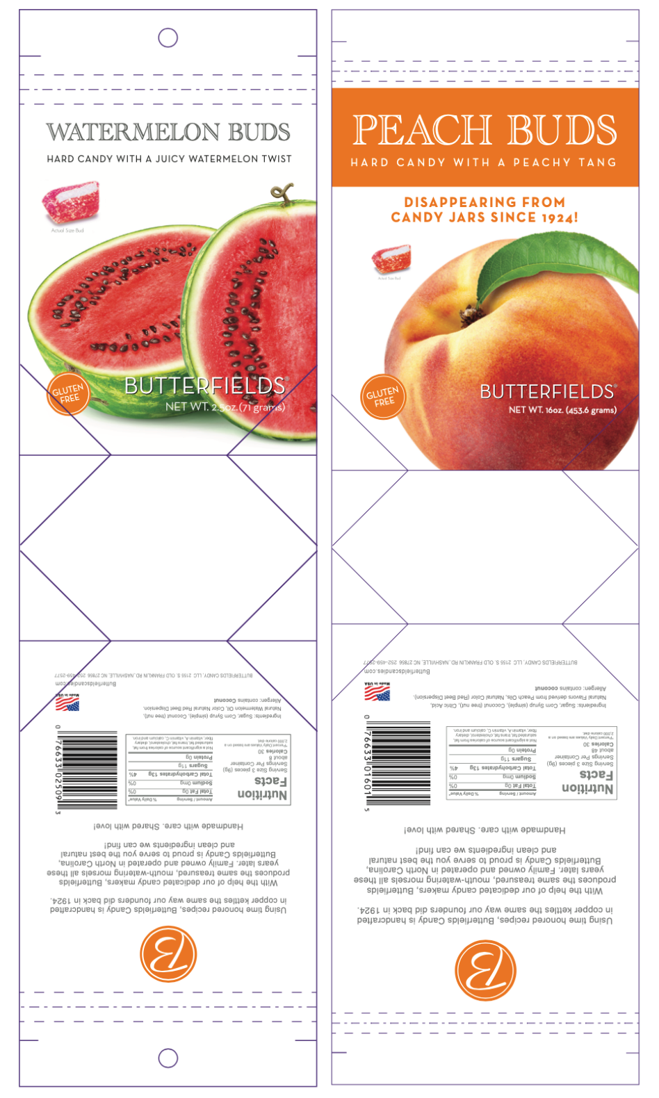
This project involved updating outdated packaging designs for Butterfields Candies, a company without access to editable working files. I recreated the original artwork from existing flat designs, allowing us to make key revisions and introduce new product variations. Throughout the process, I worked closely with a digital press to ensure accurate color reproduction and proper file preparation for printing.
A major challenge arose with the packaging's lamination material, which caused unexpected issues during digital printing. While the technical solution extended beyond my design expertise, I remained committed to seeing the project through—coordinating with press technicians, the production team, and the client until we reached a successful resolution. This experience reinforced the importance of adaptability and problem-solving beyond the creative phase when working with complex packaging materials.
Annie's Bakery
December 2021 - February 2022
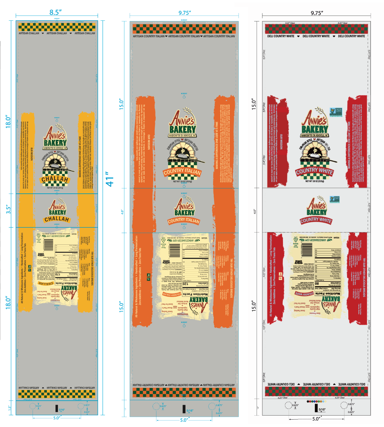
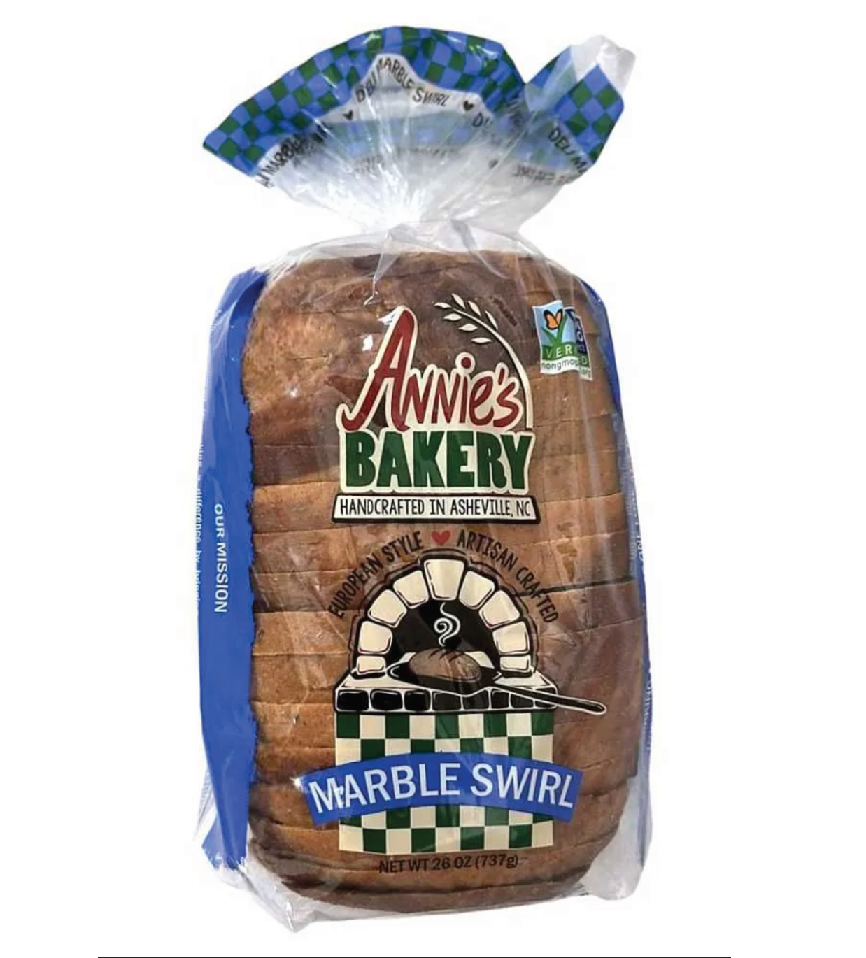
This project was a collaboration with a small bakery looking to refresh the artwork for their specialty bread bags. The client did not have access to original working files, so I reconstructed and refined their existing design elements from PDF references to create high-quality, print-ready artwork. I worked closely with their team to elevate the visual appeal while preserving brand familiarity, and coordinated with internal graphics departments, production teams, and ink technicians to ensure a smooth transition from design to print. This was one of the first packaging projects I managed from concept to retail shelf, strengthening both my technical precision and cross-functional collaboration skills.
Sokal | Automotive Advertising Designs
While working as a Graphic Designer and Photographer at Sokal Media Group, I contributed to the creation of high-volume marketing materials for automotive clients across the region. The attached pieces demonstrate my ability to work within strict brand guidelines while producing engaging, conversion-driven advertising. From print flyers and promotional offers to digital banner layouts, my work supported both national brands and local dealerships. This role emphasized quick turnaround times, attention to compliance details, and clear visual hierarchy—skills essential in fast-paced agency environments.
Monthly Promotional Web Banners
Ranging from 2018 - 2020
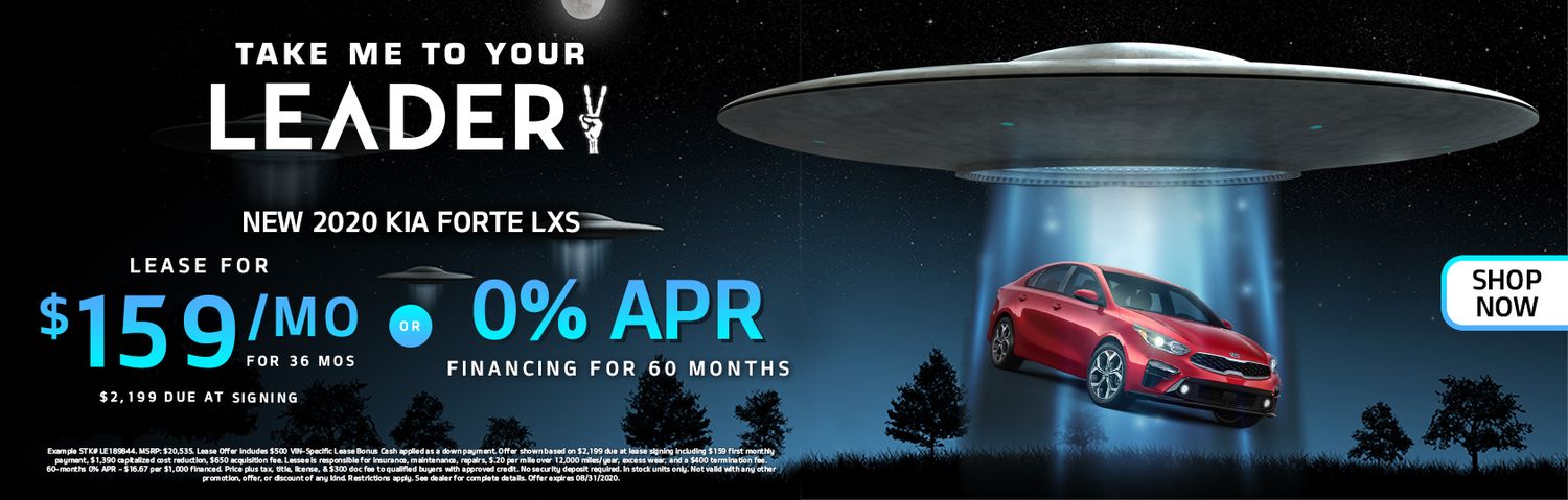
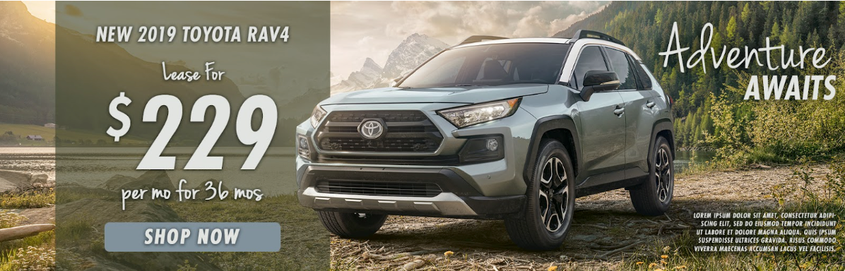
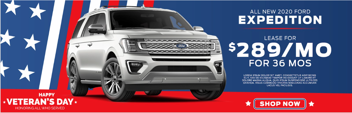
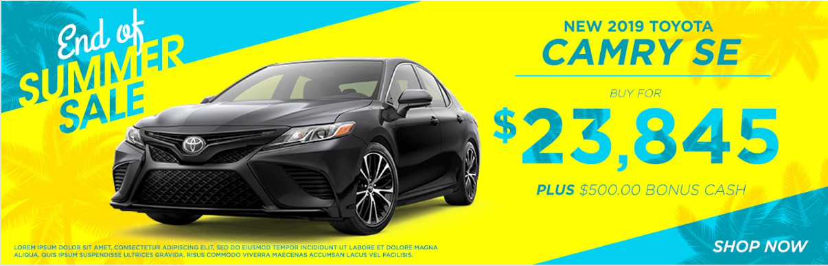
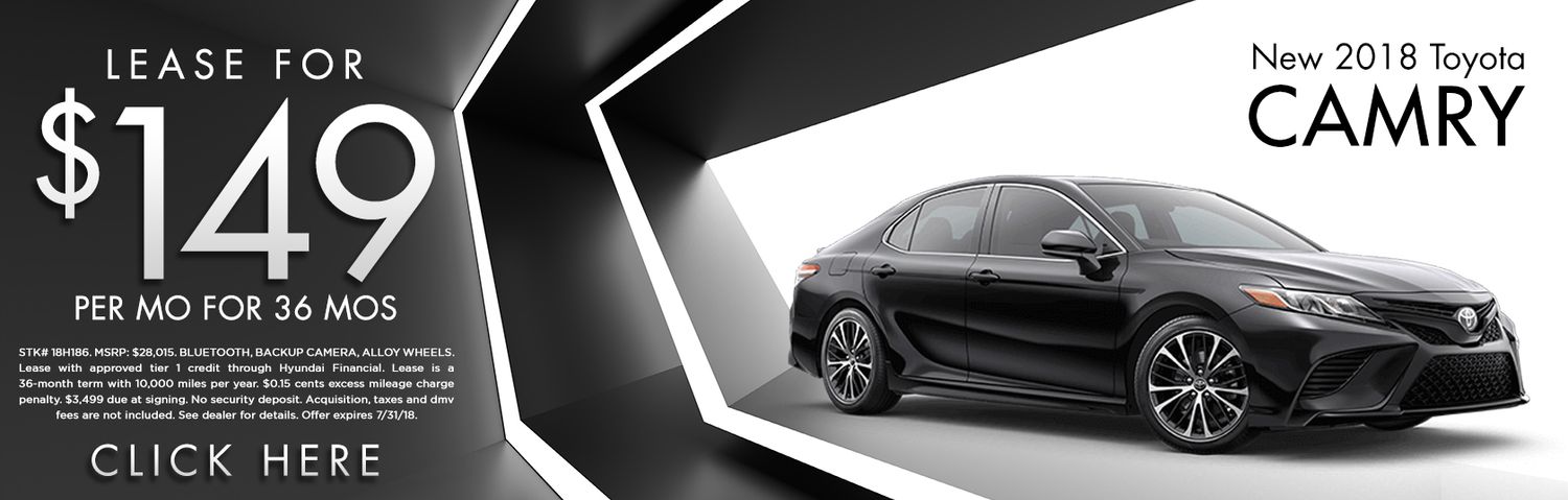
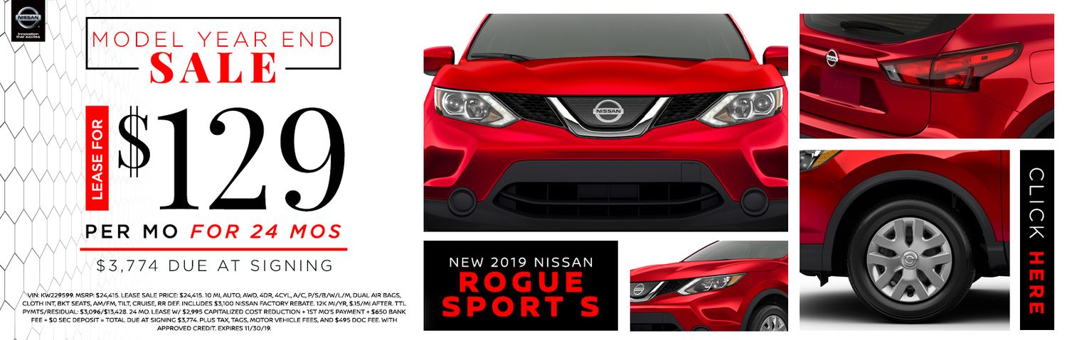
As part of my role at Sokal, I was responsible for designing monthly creative web banners for a range of automotive clients, including national brands and regional dealerships. The examples shown highlights multiple digital campaigns created. Many featuring multiple angles of the vehicle and bold, clear typography to emphasize the promotional offer. These assets were created to drive engagement and conversions across dealership websites and digital ad placements. Each banner required brand accuracy, attention to detail in vehicle imagery, and a strong visual hierarchy to clearly communicate lease terms and disclaimers—often under extremely tight deadlines.

Leader Auto Group
August 2020
This flyer is an example of a high-impact, information-dense design created during my time at Sokal Media Group. While the layout required accommodating a large volume of text, I focused on establishing a clear visual hierarchy through typographic contrast, spacing, and focal areas to guide the viewer's attention.
This type of layout showcases my ability to organize complex content without overwhelming the design. While I'm confident working with text-heavy materials, I also have experience creating clean, minimal designs that make use of negative space and refined structure.
Kelly Charity Challenge Campaign Flyer
March 2019
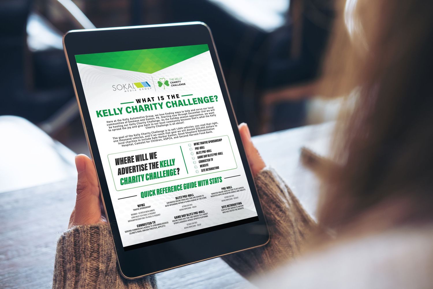
The goal of this design for Kelly Automotive was to present detailed campaign information in a clear, engaging, and brand-aligned format. Using Kelly's signature green as the primary brand color, I developed a clean and structured layout that balances visual hierarchy with approachability. Bold headers and high-contrast typography make key messages pop, while a two-column format guides the reader smoothly through the campaign's key information. Careful spacing and alignment create a professional feel, while graphic accents add energy and personality to the piece. This project highlights my ability to transform complex information into an accessible, visually polished piece that aligns with brand standards and communicates with warmth and clarity.
Freelance Design & Creative Collaboration
As a freelance graphic designer, I’ve had the opportunity to work with a diverse range of clients—including small businesses, political campaigns, fashion brands, and other marketing & branding professionals. My freelance work includes logo design, brand identity systems, social media content, print collateral, and specialty projects like a bridal tab book for client planning. These collaborations have allowed me to build strong client relationships, manage timelines independently, and translate ideas into meaningful visual solutions. With each project, I aim to deliver clean, thoughtful design that’s aligned with both the client’s voice and their business goals.
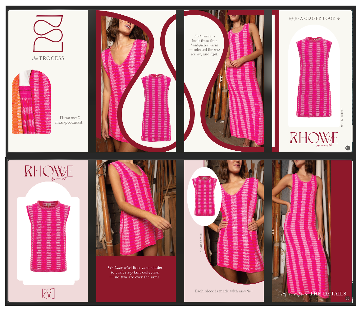
Anna Cate Collection | Instagram Story Templates
June 2025
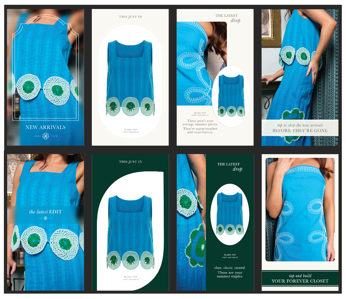
For Anna Cate Collection and their sister brand, Rowe, I design elevated Instagram Story content to promote seasonal fashion drops and key collections. Using a combination of ghost mannequin images and styled campaign photography, I create polished, on-brand visuals that highlight new arrivals in a clean and compelling way.
Each set includes micro copy and strategic layout sequences, crafted in close collaboration with the designer to reflect each brand’s distinct voice and high-end aesthetic.
Final deliverables include both animated MP4s and static JPEGs, optimized for Instagram. I regularly produce 8 custom frames per collection—often across 3 to 10 collections at a time—ensuring each campaign is visually cohesive, engaging, and ready for launch.

Medlin Davis Gown Division | Bridal Tab Book Design
August 2024
This project involved designing a multi-page tabbed booklet for Medlin Davis’s bridal division—a premium dry cleaning and preservation service. The goal was to create
an informational piece that was both visually appealing and easy for brides to navigate. The project began with only a general size reference, so I collaborated directly with
the print vendor to confirm precise dimensions and develop a custom die line template to ensure accurate plate creation.
I was provided with brand guidelines and page content, which I used to craft a clean, engaging design that aligned with the company’s visual identity. The final product
included a cover and four information-heavy tabbed pages, each carefully laid out to balance clarity with aesthetic appeal. The finished booklet was designed to educate clients while reinforcing the brand’s professionalism and attention to detail—turning a purely functional piece into a polished, consumer-friendly guide.
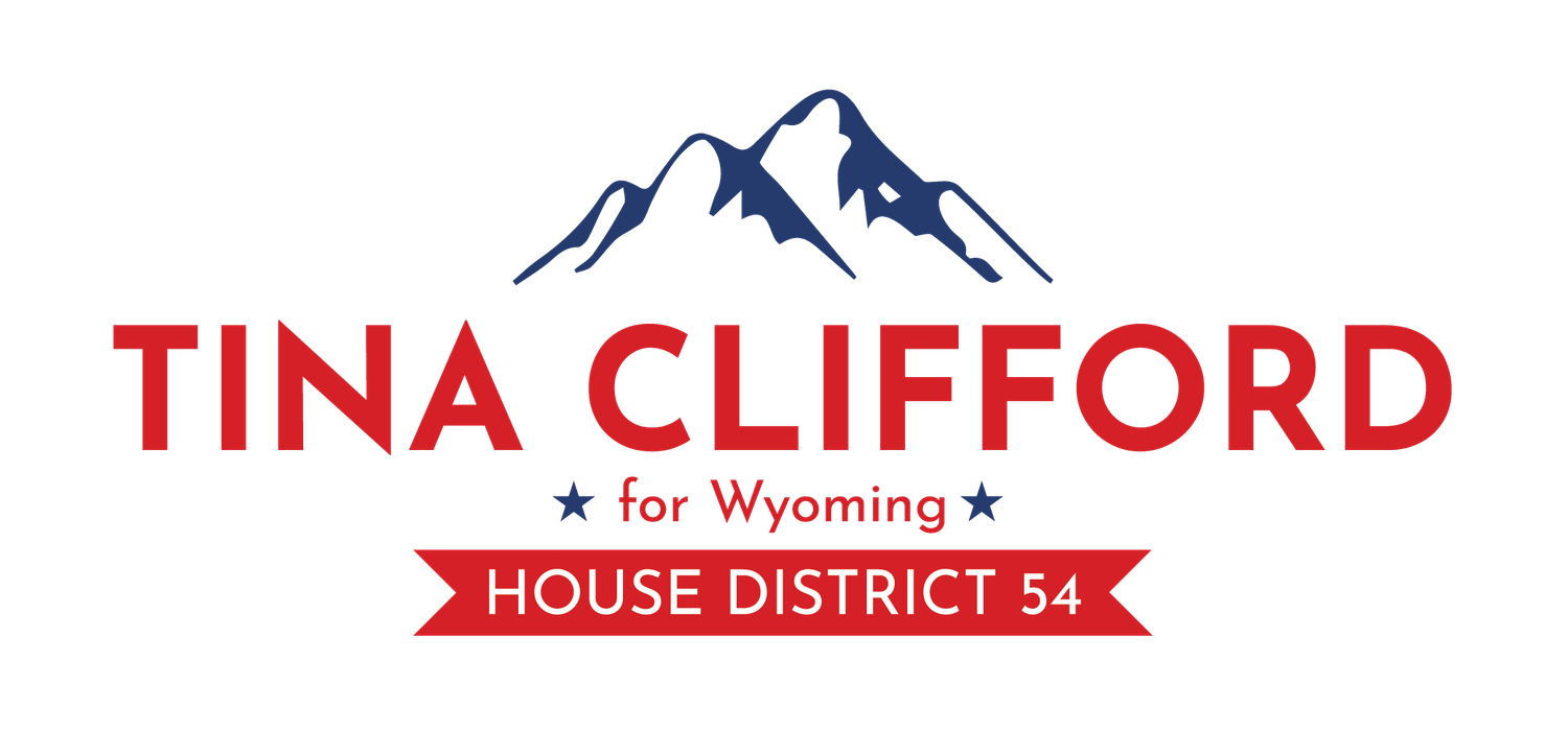
Campaign Logo Design
June 2024
This logo was created for Tina Clifford’s campaign for Wyoming House District
54, a region nestled at the base of the Wind River Mountains. Inspired by the
area’s natural beauty and the stylistic cues of other local campaign branding,
the design features a clean mountain silhouette paired with bold, modern
sans-serif typography.
A prominent banner highlights the district number, ensuring immediate clarity
for viewers—particularly important for visibility on small-scale political signage. Designed with practicality and visual impact in mind, the logo was used across Tina’s campaign materials, including road signs, digital platforms, and print collateral. The result is a grounded, professional identity that reflects both the strength of the region and the clarity of her message.
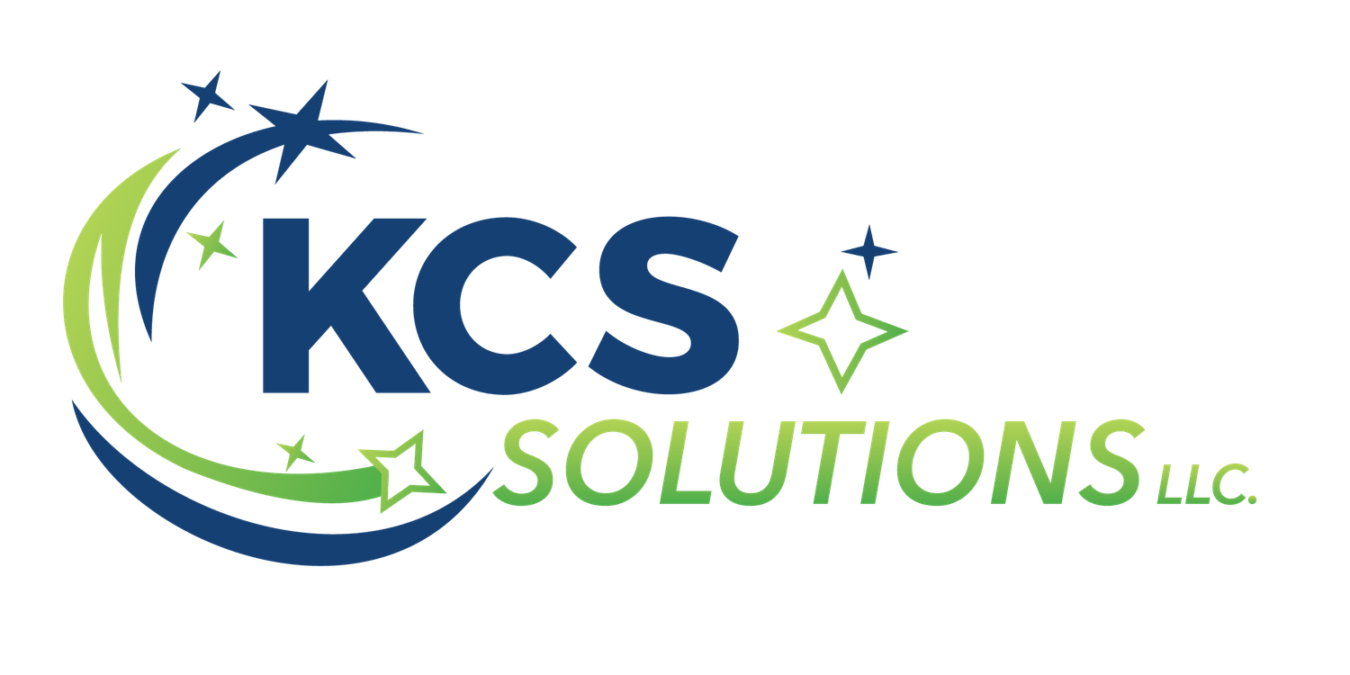
Cleaning Company Logo
April 2022
KCS Solutions—a one-woman cleaning crew—wanted a fresh, approachable mark that instantly signals “spotless.” I combined her initials (“KCS”) in a bold, modern typeface with a cool blue-and-green palette that conveys trust, freshness, and eco-friendly service. A dynamic swoosh to the left adds motion, while diamond-shaped “sparkles” reinforce the idea of a pristine finish. The result is a clean, memorable logo that works just as well on uniforms and van decals as it does on invoices and social media. To ensure seamless use across every touchpoint, I exported the final artwork in multiple file types (AI, PDF, PNG, SVG) and color profiles (CMYK, RGB), along with simplified one-color and reversed versions for maximum versatility.

Local Homestead Logo
March 2020
Big October Homestead is a passion project turned small business, launched by
one of my long-time clients. They envisioned a logo that combined a warm,
vintage-inspired aesthetic with modern simplicity—something that felt both handmade and market-ready.
Through a collaborative process and multiple concept sketches, we landed on a final design that balances a worn, retro-style font with clean lines and a bold
sans-serif accent. The result is a versatile logo that maintains character while being flexible enough for a wide range of uses, from product packaging and labels to signage and social media.

Residential Construction Logo
November 2019
This freelance client approached me while launching a construction and custom woodworking business, seeking a logo that could reflect their craftsmanship and stand out across digital and physical platforms—including eventually being branded directly into their furniture pieces.
During our consultation, the client expressed interest in a “hipster” aesthetic with a modern edge. I designed a logo that balanced decorative typography with bold, clean outlines to achieve a strong visual identity that felt both handcrafted and contemporary. The result is a versatile mark that can scale effectively from business cards to wood-burned branding, aligning with the client’s long-term goals.
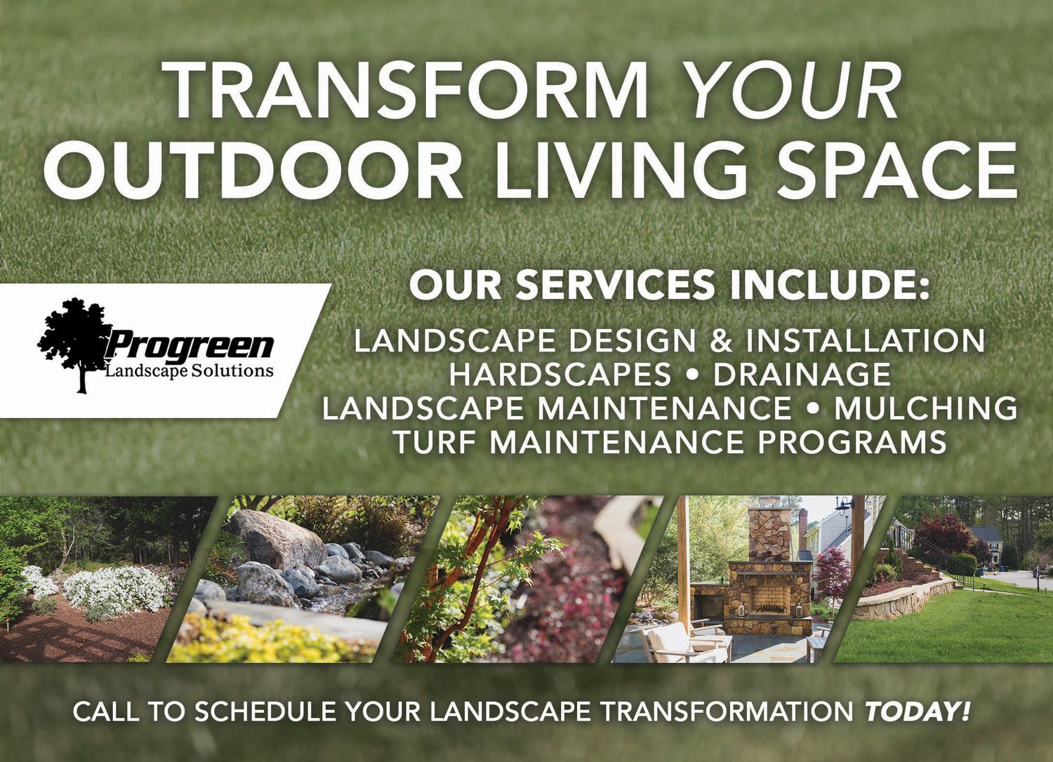
Progreen Landscape | Seasonal Postcard Series
September 2018
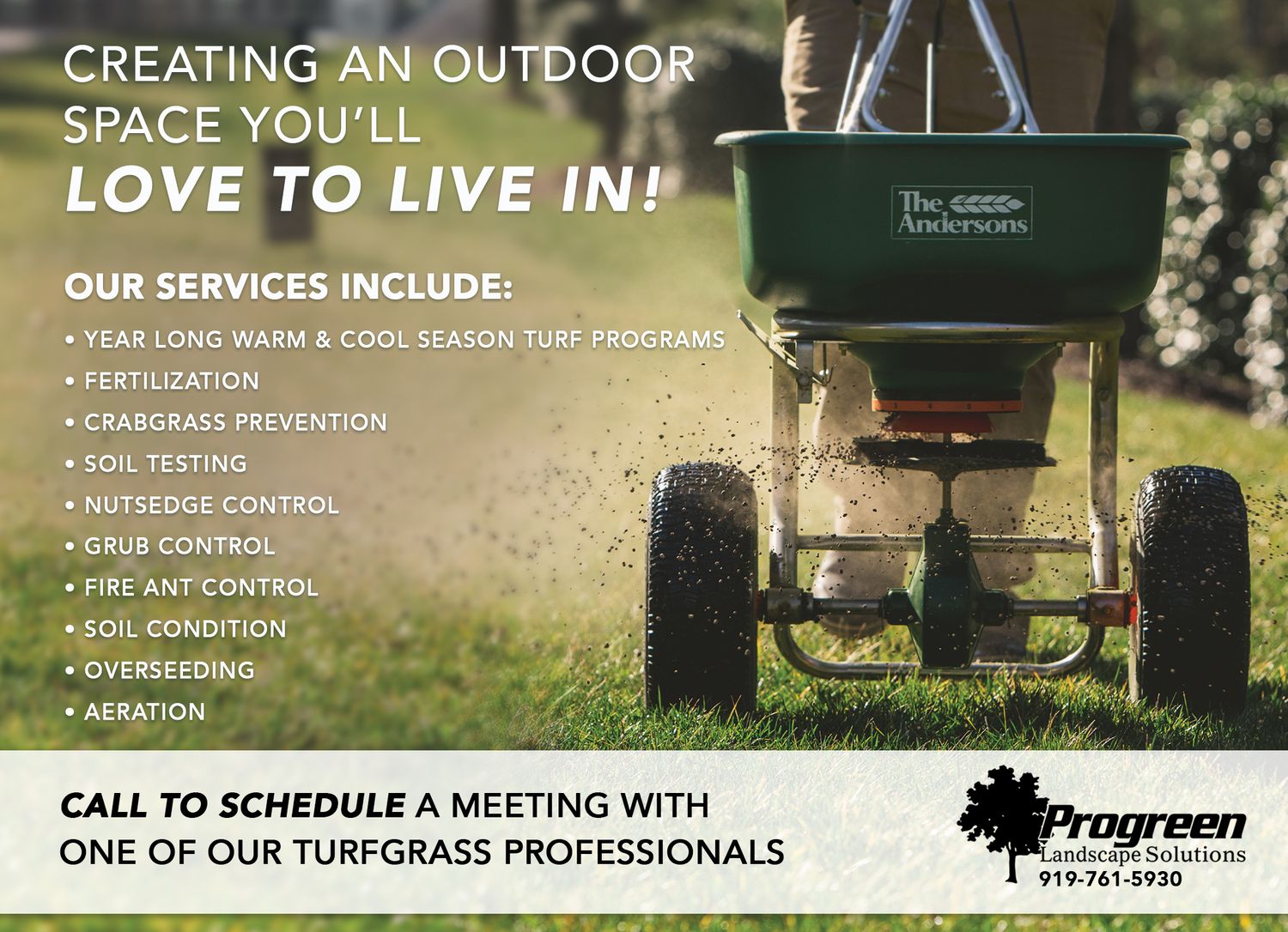
This project involved designing two promotional postcard variations for Progreen Landscape Solutions, a high-end landscaping company. The goal was to create cohesive, visually engaging mailers that aligned with the company’s seasonal services and marketing calendar.
I was provided with prewritten content and professional photography, but it was essential to pair the right imagery with the appropriate messaging—something that required a solid understanding of the company’s services, client base, and visual tone. This project reinforced the importance of knowing your client’s industry, not just aesthetically but functionally, to ensure the final design communicates clearly and effectively.
Barton College Art Department | Senior Exhibition
April 2017
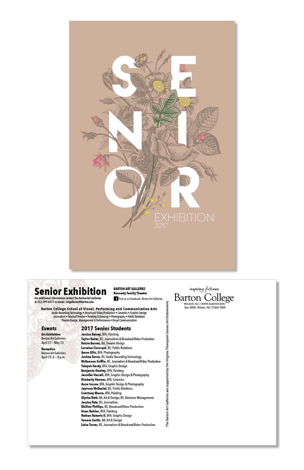
During my final year at Barton College, I was honored to be selected by the Art Department to design the official postcard for the Senior Art Exhibition—chosen from among the senior graphic design students. Staying true to both the show’s theme and my personal aesthetic, I created a design that blended natural elements with bold pops of neon, aiming to strike a balance between classic and modern. Clean, sans-serif typography was inlaid within the graphic composition to create visual contrast and clarity.
Once the front and back designs were approved, I worked closely with the college’s marketing department to ensure all print specifications and mailing regulations were met, overseeing the process from concept through production.